The five-second inbox reality
Most newsletters do not fail because the author lacks insight. They fail because the layout fights the reader from the moment it opens.
When an issue lands in someone's inbox, they rarely settle into an armchair eager to dissect every paragraph. They open it on a phone screen while waiting for an elevator, standing in line for coffee, or triaging forty unread messages between meetings. Their default reaction is not curiosity; it is inbox fatigue.
In that first glance, your layout has five seconds to answer five subconscious questions:
- What publication is this? Is the brand instantly recognizable without checking the sender address?
- What is the core takeaway today? Can I understand what matters before scrolling?
- Where do I start? Does the eye lock onto a clear anchor, or wander across five competing banners?
- Can I scan this without exhaustion? Is the content chunked into digestible blocks, or trapped in an unbroken wall of text?
- What action should I take next? Is there one obvious link, decision, or insight to carry away?
If your layout answers those questions immediately, the subscriber reads on. If it fails, they swipe back, archive the message, or unsubscribe. Good newsletter design is not about making emails look like promotional agency flyers. It is information architecture: structuring thoughts so cleanly that reading feels frictionless.
What is newsletter design?
Newsletter design is the systematic arrangement of text, media, whitespace, and interaction cues tailored to the technical constraints of modern email clients and web archives.
It is not graphic design transferred to an email body. In email, you do not control the canvas. You are negotiating with dozens of competing email engines—from Apple Mail on iOS to Gmail on Android and Microsoft Outlook on desktop—each rendering HTML and CSS through different standards.
Effective newsletter design balances three practical forces:
- Editorial hierarchy: Helping readers parse complex concepts rapidly through established heading scales, pull-quotes, and distinct section breaks.
- Technical resilience: Writing HTML and inline styles that hold together across dark mode inversions, mobile screens, and strict payload limitations without falling back to broken table cells.
- Brand continuity: Ensuring that the visual language inside the inbox feels like an authentic extension of your publication website. As we explored in our guide on professional newsletter website design, nothing damages subscriber trust faster than joining a clean, modern website only to receive an email that looks like an unstyled text dump.
What makes a good newsletter design?
Through building and shipping dozens of publication layouts, I have learned that durable newsletter designs share six core principles:
1. Unmistakable hierarchy
A reader should never guess where one section stops and another begins. Great layouts use a disciplined typographic scale: a prominent H1 for the issue thesis, bold H2s for section anchors, and compact metadata tags for context. When everything is bolded or boxed, nothing stands out.
2. High-legibility typography
The core deliverable of any newsletter is written thought. Calibrate body text between 16px and 18px with a generous line height of 1.55 to 1.7. Stick to robust system font stacks (such as -apple-system, BlinkMacSystemFont, 'Segoe UI', Roboto, sans-serif) that degrade gracefully when external web fonts fail to load.
3. Disciplined vertical spacing
Amateur layouts crowd content together. Providing 32px to 48px of vertical clearance above major headings signals a mental pause, allowing the reader to finish one idea before digesting the next.
4. Restrained imagery
Images should illustrate data, prove claims, or set context. They should never carry essential body text. Millions of corporate inboxes block images by default; if your headline is burned into a hero JPEG, subscribers see a blank box. Always pair visuals with descriptive alt text and live HTML copy.
5. Action clarity
When you present twelve competing buttons, click-through rates decline. As documented in our analysis of why nobody clicks your CTA, friction multiplies when choices compete. A well-designed newsletter identifies one primary action for the issue and renders secondary links as subdued inline anchors.
6. Accessibility and dark mode hygiene
Every text element must satisfy contrast benchmarks, such as the W3C WCAG 2.1 AA requirement of at least 4.5:1 for body copy. Transparent logos need subtle light borders so black lettering does not disappear when clients invert white backgrounds to dark mode.
The essential parts of a well-designed newsletter
Search queries often ask whether an effective newsletter requires five, eight, or twelve components. In practice, a resilient publication operates as a single modular system built from ten essential parts:
| Component | Primary Role | Design Best Practice |
|---|---|---|
| Preheader Text | Inbox preview snippet | Keep under 90 characters; complement the subject line rather than repeating it. |
| Masthead & Header | Brand identity & edition marker | Keep vertical height under 80px; display logo, date, and issue number cleanly. |
| Opening Hook | Executive lead-in | 2–3 sentences summarizing why today's issue matters right now. |
| Anchor Feature | Core value delivery | Deep-dive essay, analysis, or lead story formatted with clear subheadings. |
| Modular Content Cards | Secondary curation | Card blocks with subtle borders (#e4e4e7) for tools, links, or quick briefs. |
| Visual Proof / Data | Illustration & evidence | Clean charts or screenshots optimized at 2x resolution with responsive styling. |
| Primary CTA | Conversion driver | High-contrast button (minimum 44px touch target) focusing on one core action. |
| Native Sponsor Block | Monetization transparency | Distinct visual background tag clearly labeled "Sponsor" or "Partner". |
| Feedback Loop | Subscriber engagement | 1-click rating poll or direct reply prompt to boost sender deliverability. |
| Utility Footer | Compliance & hygiene | Physical postal address, manage preferences, and a friction-free unsubscribe link. |
How to design a newsletter step by step
If you are building a new publication or redesigning an existing template, follow this structured ten-step process:
Step 1: Define the reading job. Clarify what purpose this issue serves. A breaking technical briefing requires rapid, scannable data points; a founder essay requires warm typographic pacing; a curated roundup requires clean product cards. Design always follows editorial intent.
Step 2: Establish the content hierarchy. Outline your issue anatomy before drafting copy. Establish whether your edition leads with one deep dive or five equal modular sections so your weekly production follows a predictable pattern.
Step 3: Choose the layout pattern. Default to a single-column container with modular cards. Multi-column grids frequently break or render unpredictably on mobile devices, whereas single-column flows adapt naturally.
Step 4: Calibrate typography and spacing. Set body text to 16px–18px with 1.6 line height. Maintain proportional contrast: H1 at 28px–32px, H2 at 22px–24px, and metadata badges at 12px monospace. Apply 36px vertical clearance above major headers.
Step 5: Pick a disciplined color palette. Limit palette choices to three tokens: a dark neutral for text (#0a0a0c), a clean white surface (#ffffff with subtle #f8f8fa card fills), and one brand accent (such as electric lime #84cc16) reserved for CTAs and highlights.
Step 6: Build the layout container. Standardize desktop width between 600px and 640px, paired with width: 100%; max-width: 640px; margin: 0 auto; for fluid mobile scaling. Provide at least 16px of horizontal padding to prevent text from touching screen edges.
Step 7: Optimize retina images. Size raster graphics at 1200px width for 600px containers (2x DPI) to ensure crisp rendering on high-resolution smartphone screens. Compress assets under 150KB and always supply explicit width, height, and alt tags.
Step 8: Construct bulletproof CTAs. Build clickable buttons using table cells or VML button markup with at least 12px vertical and 24px horizontal padding. Ensure the clickable surface area satisfies the 44x44px touch target standard.
Step 9: Test dark mode and client rendering. Send live test broadcasts to physical devices running Apple Mail, the Gmail app, and Outlook. Confirm that transparent logos do not vanish against dark mode backgrounds and that text scales properly.
Step 10: Audit HTML payload size. Inspect rendered code to ensure the raw HTML document remains well below 100KB, preventing Gmail from clipping your footer and severing tracking pixels.
Newsletter layout: how should a newsletter be structured?
Layout patterns solve different reading challenges. Selecting the right structure depends on how your audience consumes information:
1. Single-column editorial layout
The single-column layout is the foundation of long-form thought leadership and personal founder essays. Text flows vertically in a centered 600px column. Because there are no sidebars or multi-column grids, the layout translates cleanly to mobile devices without shifting an element. It feels intimate, respectful, and distraction-free.
2. Modular card layout
The modular layout breaks complex newsletters into self-contained visual cards bordered by subtle lines (1px solid #e4e4e7). Each card features a distinct topic label, headline, summary text, and link. Readers can scan the entire issue in twenty seconds and dive into the specific cards that interest them.
3. Curated digest / link-heavy layout
Curated digests prioritize high information density. Instead of full paragraphs, they rely on bolded link headlines followed by two-sentence commentary notes and domain tags. Group links under thematic H2 headers rather than dumping forty URLs in an undifferentiated list.
4. Data and metrics snapshot layout
Common in SaaS metrics updates and financial newsletters, this layout incorporates metric callout blocks (KPI numbers displayed in large bold text alongside percentage change badges). When formatting data, avoid complex multi-column HTML tables that break on narrow mobile screens; use simple stacked key-value pairs that read comfortably on mobile.
What size should a newsletter be? (Width, clipping, and mobile viewports)
Dimensional sizing in email newsletters involves hard technical constraints:
The 600px width benchmark
For two decades, the standard container width has hovered around 600px. Modern designs typically use 600px to 640px. Desktop email clients like Outlook and Apple Mail open messages within split preview panes that occupy limited horizontal space. Furthermore, typographical science demonstrates that lines exceeding 75 characters tire the human eye. A 600px column maintains optimal typographical measure (55 to 70 characters per line at 16–18px font size).
The 102KB Gmail clipping threshold
Gmail automatically truncates any email message whose HTML file size exceeds 102KB (102,400 bytes). When triggered, Gmail cuts off the bottom of the email and inserts a warning: "[Message clipped] View entire message".
This truncation breaks open-rate tracking pixels (usually located at the bottom of the email), severs compliance footers, and hides the unsubscribe link. Only raw HTML code and inline CSS count toward this 102KB limit—externally hosted images do not. However, copy-pasting bloated code or embedding inline base64 images will quickly trigger the cutoff.
Image dimensions and file compression
For a 600px email container, export raster images at 1200px width to deliver 2x Retina sharpness on smartphones. Compress every graphic aggressively to keep file sizes under 150KB (and under 80KB where feasible), ensuring rapid loading over cellular networks.
Newsletter design examples: lessons from real blueprints
Rather than analyzing theoretical mockups, let's examine real design blueprints built for actual publications. At Builder Hustle, we designed ten production newsletter templates and matching landing pages. Each template solves a specific structural challenge.
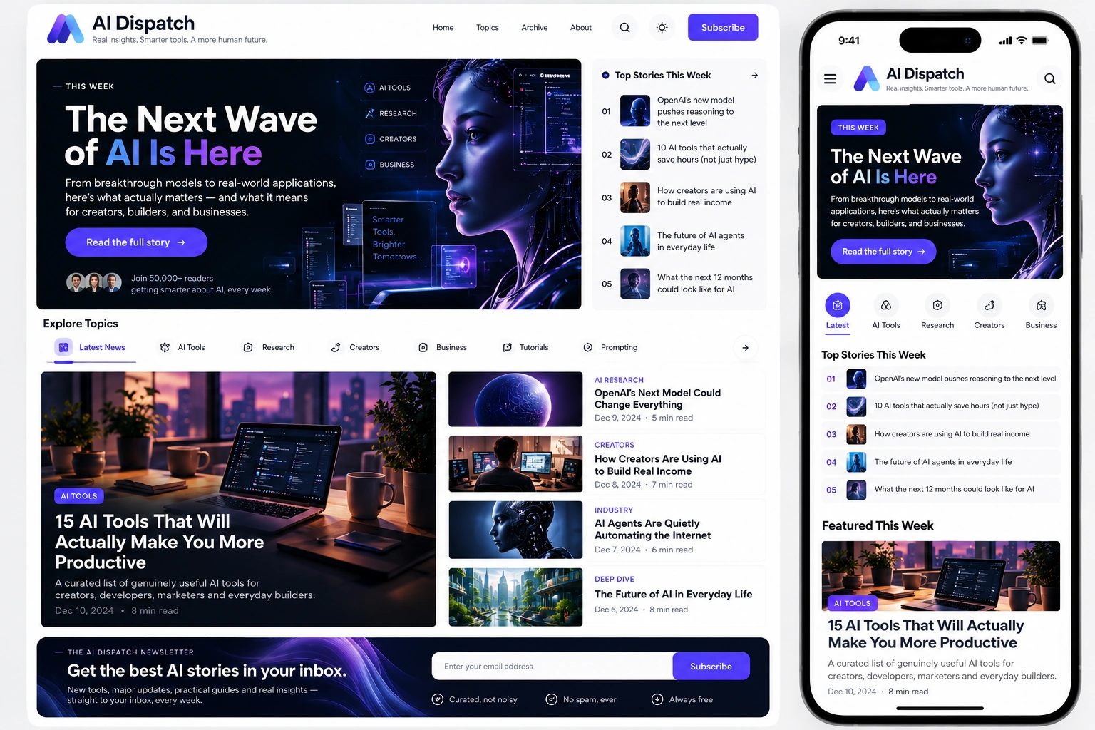
1. AI Dispatch: Technical briefing and structured curation
Editorial intent: Delivering rapid, high-signal technical news and artificial intelligence workflows to developers and product builders.
- Dual-level scannability: Each item opens with an uppercase monospace tag (e.g.
[MODELS]) and a bold headline, followed by a two-sentence takeaway. Readers scan the issue in fifteen seconds by reviewing tags and bold anchors alone. - Restrained monospace accents: Monospace fonts are reserved strictly for metadata and code snippets, preserving a clean geometric sans for body copy.
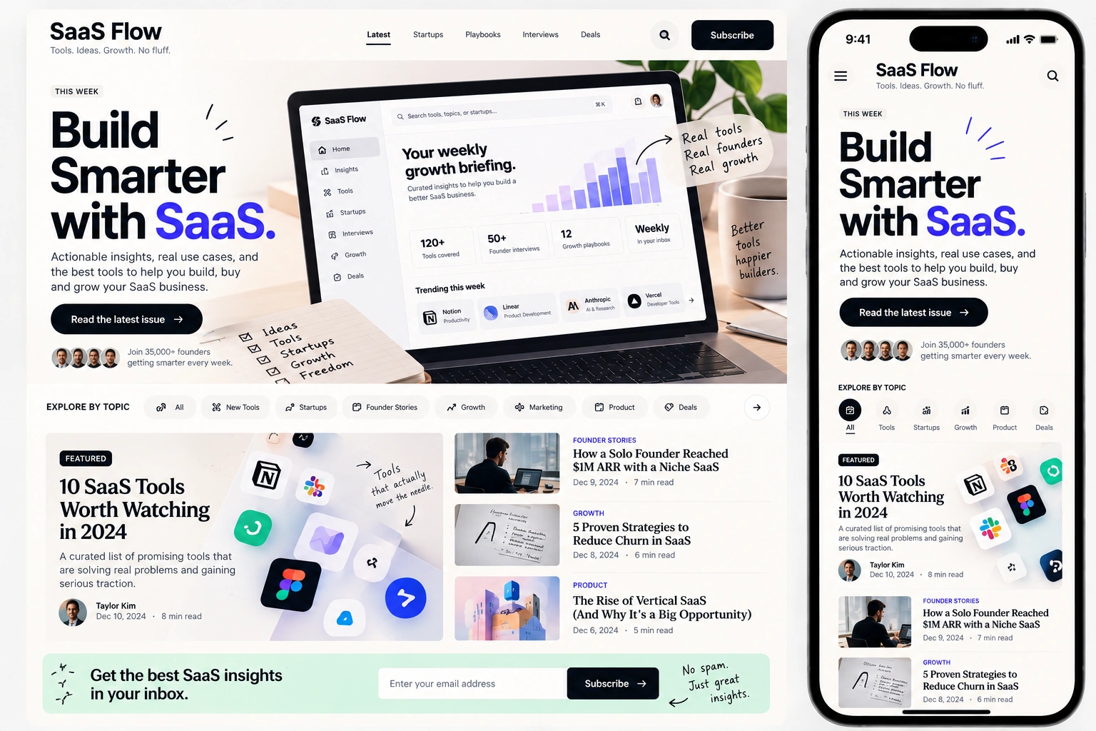
2. SaaS Flow: Product changelogs and metrics dashboards
Editorial intent: Communicating product updates, feature rollouts, and business metrics to customers and software operators.
- Metric snapshot blocks: Highlights monthly KPIs (such as uptime, release velocity, and MRR) in prominent cards before narrative copy begins.
- Versioned changelog badges: Tags updates with release pills (e.g.,
v2.4.0orFEATURE) to maintain a structured product release cadence.
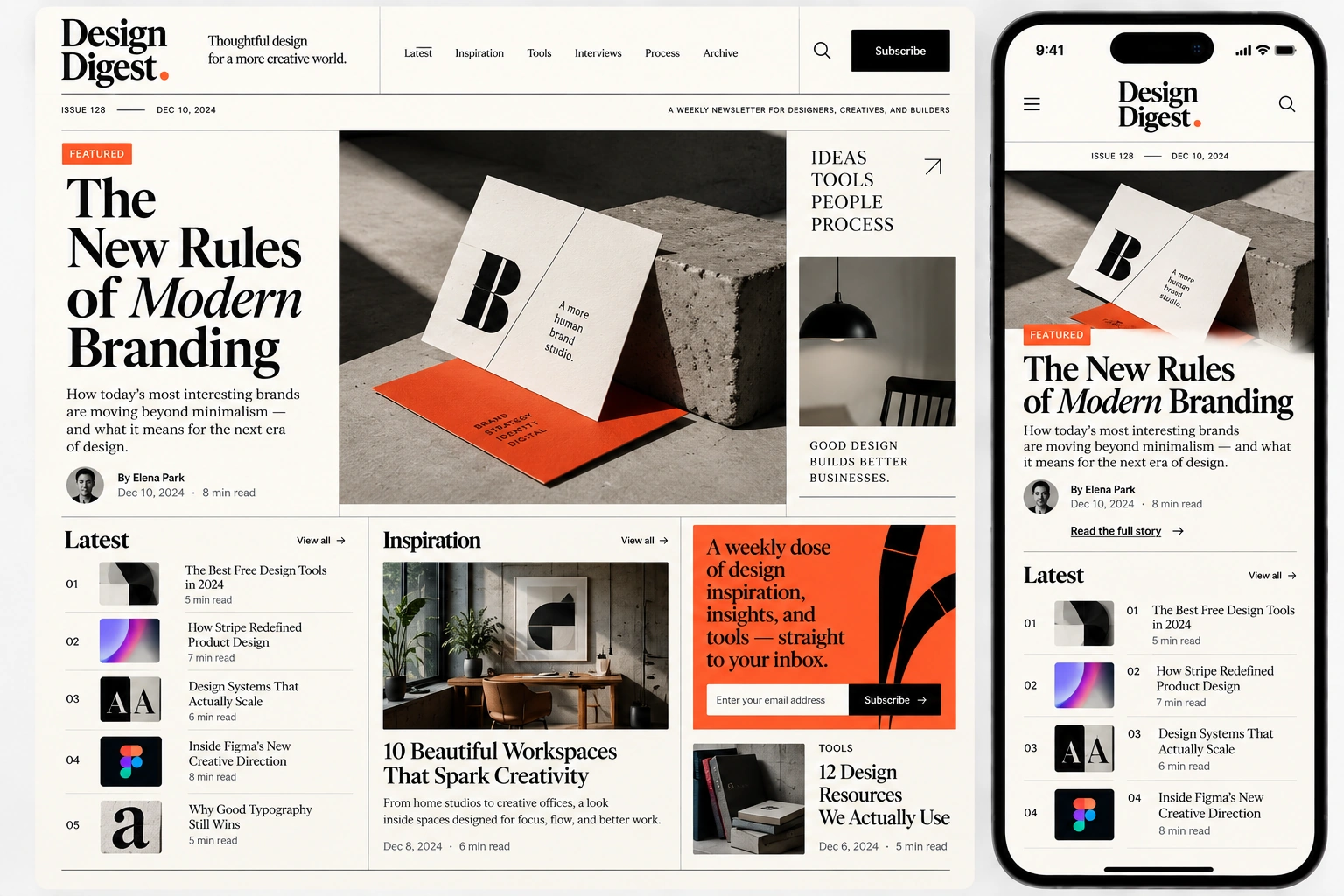
3. Design Digest: Typographic restraint and visual rhythm
Editorial intent: An independent visual magazine for product designers, art directors, and creative studio founders.
- Generous negative space: Expands vertical section gaps to 48px, giving portfolio visuals and creative analysis room to breathe.
- Editorial typography: Pairs literary headline pacing with neutral body text while eliminating superfluous badges, borders, and neon fills.
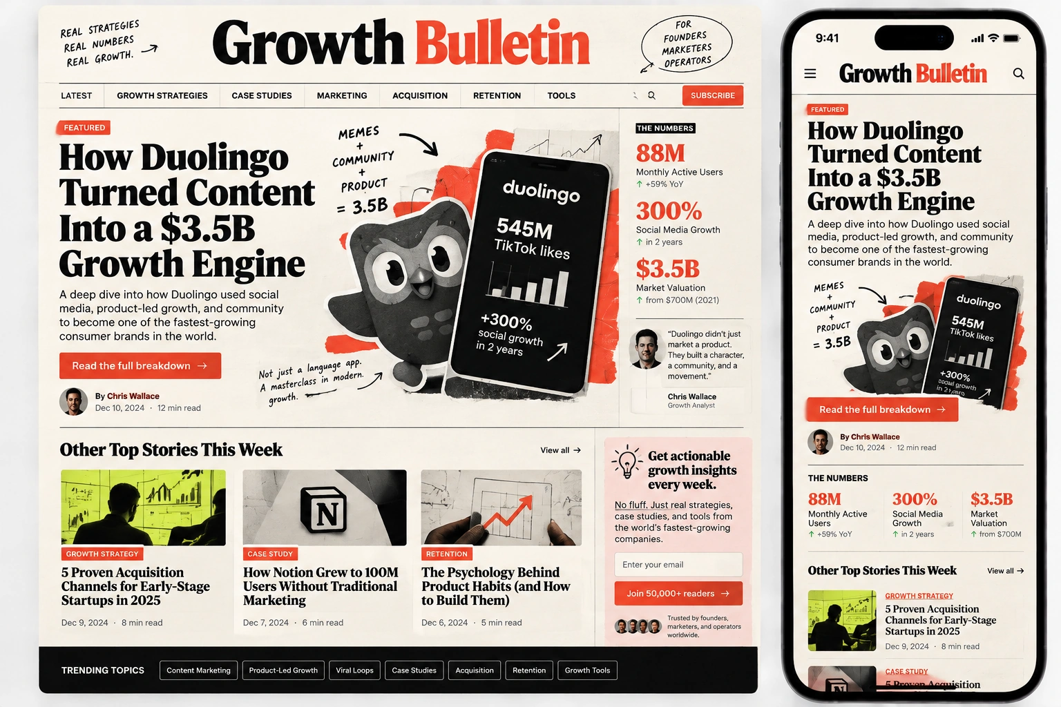
4. Growth Bulletin: Dense business intelligence and execution playbooks
Editorial intent: Delivering actionable acquisition strategies, conversion benchmarks, and tactical playbooks for performance marketers.
- Scannable bullet takeaways: Key execution steps use custom high-contrast bullets rather than discursive paragraphs.
- Unmistakable action blocks: Concludes strategic breakdowns with high-contrast summary callouts framed in electric lime.
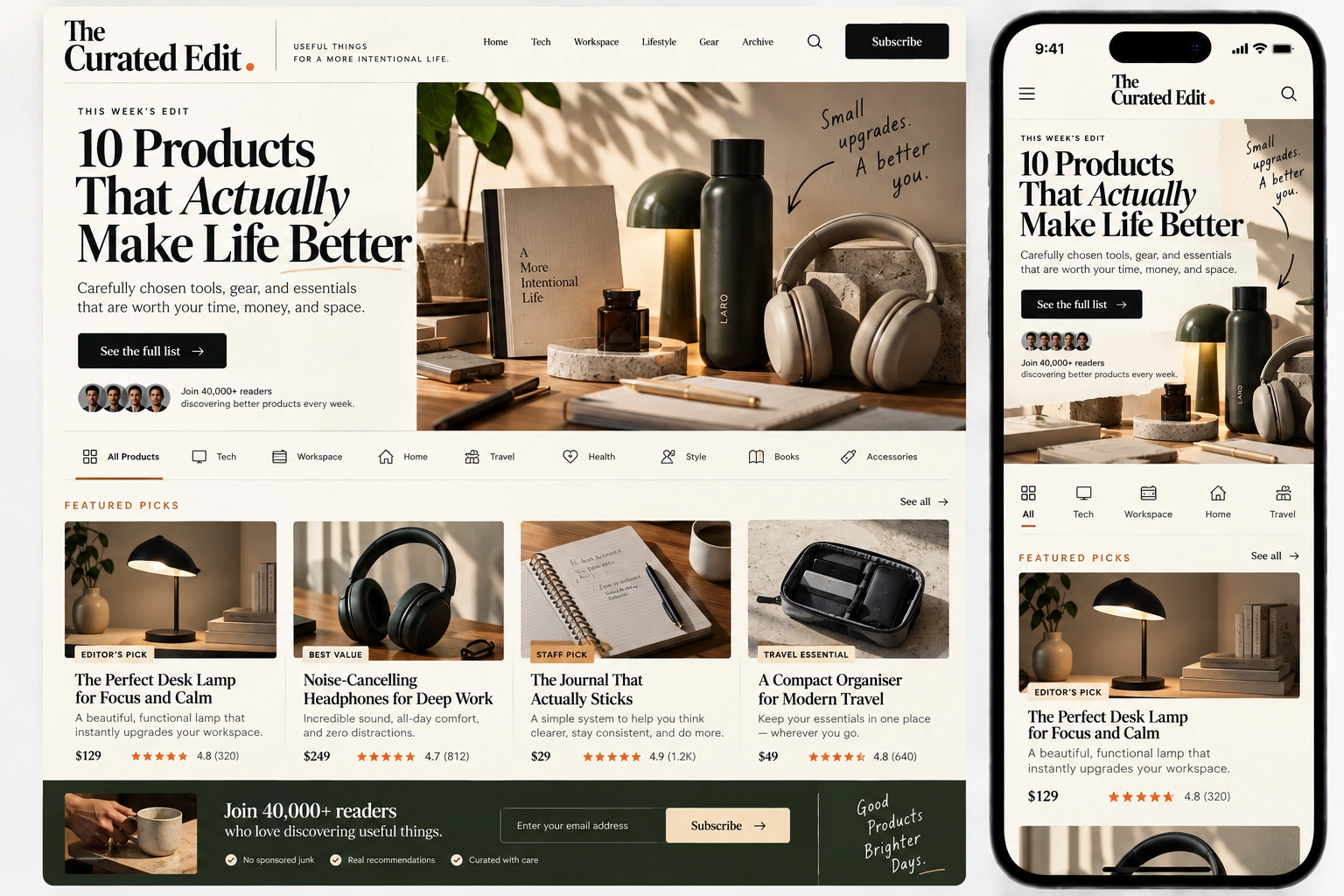
5. The Curated Edit: Curated commerce and product discovery
Editorial intent: Recommending curated physical gear, tools, and digital resources to discerning consumers and creative professionals.
- Consistent card geometry: Standardizes product modules with a 1:1 image, brand label, product name, price pill, and two-sentence verdict.
- Singular outbound link paths: Every card features one dedicated text link, eliminating confusing multiple-link traps.
You can explore all ten live designs and matching email architectures in our HTML newsletter template gallery.
Newsletter design for different types of publications
Design priorities shift based on your publication format:
Editorial and news publications
Prioritize information velocity and clear scannability. Place a 60-second executive summary at the very top. Organize secondary stories by topic sections (e.g., Tech, Policy, Markets) using consistent section dividers. Keep visual assets small and informative.
SaaS and product newsletters
Focus on product utility and user retention. Showcase real interface screenshots, feature GIFs, and code snippets. Keep release changelogs modular so users can quickly see whether a feature affects their workflow.
Creator and personal essays
Prioritize intimacy and narrative flow. Use a minimalist single-column format with zero sidebar clutter. Keep the masthead minimal so your personal voice leads immediately. If you include photos, use authentic personal snapshots rather than polished stock images.
Founder and build-in-public logs
Authenticity and transparent data drive engagement. Use clean tables or callout boxes for revenue, subscriber numbers, and active experiments. Ground the design in raw, honest typography that reflects transparent building.
Corporate and internal communications
Focus on executive clarity and departmental alignment. Use clear headline hierarchy so busy employees can scan announcements in thirty seconds. Ensure full accessibility compliance and rock-solid rendering in enterprise Outlook environments.
Newsletter design tools and platforms
Depending on your technical requirements and publication stage, your tooling stack will vary:
Visual newsletter platforms (Beehiiv, Kit, Ghost, Substack)
Modern all-in-one newsletter platforms handle both the authoring interface and email delivery infrastructure. They provide built-in responsive themes, subscriber analytics, and web archive hosting. For most independent writers and media creators, these platforms offer the fastest path to a reliable, beautifully rendered publication without writing custom code.
HTML email frameworks (MJML, Maizzle)
If you require custom, bespoke layout control, writing raw table-based HTML by hand is notoriously difficult. Modern frameworks simplify this work:
- MJML: An open-source markup language that abstracts complex responsive table logic into intuitive tags (like
<mj-section>and<mj-column>), compiling down to bulletproof HTML that renders cleanly in Outlook. - Maizzle: A framework that uses Tailwind CSS to build HTML emails, automatically inlining styles and stripping unused classes during compilation.
Design and prototyping tools (Figma)
Figma is the industry standard for designing newsletter layout systems, establishing typography scales, and creating reusable component libraries before building them in code. When designing in Figma, set your artboards to 600px width for desktop and 375px width for mobile to preview real viewport constraints.
Where Canva fits (and where it doesn't)
Canva is widely searched as a newsletter design tool. It is genuinely useful for creating branded header logos, section dividing graphics, or social promo cards. However, never export an entire newsletter as a giant single image from Canva. Image-only emails trigger spam filters, fail mobile screen scaling, cannot be read by screen readers, and leave readers staring at empty boxes when image loading is disabled.
Can ChatGPT write or design a newsletter?
Generative AI assists specific parts of the production process, but cannot substitute for editorial direction:
Where AI genuinely helps:
- Outlining and structuring: Generating structural frameworks for complex topics or organizing rough research notes into a cohesive outline.
- Headline and subject line variations: Generating twenty subject line angles to test for curiosity, clarity, and open-rate performance.
- Proofreading and tone checks: Catching spelling mistakes, awkward phrasing, and repetitive sentence structures.
- Summarization: Condensing a 3,000-word podcast transcript into three concise bullet points.
Where human judgment is irreplaceable:
- Curation and taste: Deciding what news is genuinely consequential versus ephemeral hype requires deep domain experience.
- Authentic voice and perspective: Readers subscribe to newsletters for an author's distinct worldview, earned scars, and personal style. AI generates polite, bland consensus copy that sounds like every other generic blog post.
- Visual and structural balance: An AI cannot feel whether a layout feels cramped on an iPhone screen or whether vertical rhythm feels rushed.
- Fact verification: LLMs still hallucinate statistics, attribution, and technical details. Publishing unverified AI copy destroys publication credibility.
Common newsletter design mistakes
Even seasoned writers frequently stumble into layout traps that degrade reader engagement. Watch out for these eight common mistakes:
- The massive hero image wall: Placing a 600px-tall decorative banner image at the top of the email that pushes all actual reading content beneath the fold on mobile screens.
- The unformatted text dump: Eight hundred continuous words without a single subhead, bold anchor, or pull-quote. It signals cognitive exhaustion to any reader triaging their inbox.
- The image-only newsletter: Slicing an entire email into images. It ruins deliverability, destroys accessibility, and breaks when image loading is blocked.
- Competing button chaos: Placing five high-contrast buttons in an issue asking readers to join a Discord, buy a course, follow on social media, and read an article all at once.
- Desktop-first myopia: Designing on a 27-inch 4K monitor without testing how lines wrap on a 375px mobile screen. Over 60% of emails are opened on mobile devices.
- Neglecting dark mode: Using dark text inside transparent images that disappear when an email client inverts background colors.
- Bloated code triggering Gmail clipping: Allowing bloated HTML markup to exceed 102KB, severing footers and tracking pixels.
- Hiding the unsubscribe link: Making the unsubscribe link invisible or using grey-on-grey text. If an unhappy subscriber cannot find your unsubscribe button in five seconds, they will hit "Report Spam", causing severe domain reputation damage.
The pre-send newsletter design checklist
Before hitting schedule or broadcast on any issue, run through this ten-point pre-send checklist:
- Subject Line & Preheader: Does the preview text cleanly complement the subject line without repeating it?
- Header Proportions: Does your masthead take up less than 15% of the mobile screen height?
- Mobile Single-Column Reflow: Does the email render cleanly on a 375px viewport with zero horizontal overflow?
- Typographic Legibility: Is body text at least 16px with a line height of at least 1.55?
- Single Primary Action: Does the email have one clear, high-contrast primary call to action?
- Image Optimization: Are all images compressed under 150KB, sized at 2x resolution, and equipped with descriptive alt tags?
- Dark Mode Verification: Do transparent logos and graphic cards maintain contrast against black backgrounds?
- HTML File Size: Is the compiled HTML payload safely under 100KB to prevent Gmail clipping?
- Link Audit: Did you click every link in a test send to verify destination URLs and UTM tracking parameters?
- Footer & Unsubscribe Hygiene: Are your physical business address and 1-click unsubscribe links clearly legible?
Are newsletters still relevant in 2026?
In an era dominated by algorithmic feeds, short-form video platforms, and automated content generation, some question whether email newsletters remain viable. The reality is quite the opposite: newsletters are more valuable in 2026 than at any point in internet history.
Social media platforms have become volatile distribution channels where algorithmic updates can slash creator reach overnight. The email inbox represents one of the last remaining direct, permission-based communication channels where you maintain an unmediated relationship with your audience.
However, the bar for reader attention has escalated. The era of low-effort, copy-pasted link dumps is over. Subscribers aggressively prune their inboxes. The publications that thrive in 2026 are those that respect the reader through disciplined curation, an authentic practitioner voice, and thoughtful, frictionless design.
Frequently asked questions about newsletter design
What makes a good newsletter design?
A good newsletter design establishes instant clarity through strong information architecture. It relies on scannable typographic hierarchy, restrained color palettes, generous vertical whitespace, predictable content modules, touch-friendly CTAs, and resilient single-column mobile reflow rather than heavy decorative graphics.
What size should a newsletter be?
The ideal container width for an email newsletter is 600px to 640px, configured with width: 100%; max-width: 640px; to adapt gracefully to mobile viewports. Furthermore, the total raw HTML payload should remain strictly under 100KB to prevent Gmail from clipping the message.
What are the essential parts of an effective newsletter?
An effective newsletter contains ten essential parts: preheader preview text, a compact branded masthead with date/issue metadata, an opening editorial hook, structured body blocks, contextual data/visuals, a singular primary CTA, optional secondary resource links, a native sponsor placement, a subscriber feedback loop, and a compliant footer with a clear unsubscribe link.
What is the best layout format for a newsletter?
The best layout depends on editorial intent. Long-form essays thrive in a minimalist single-column format. Curated digests and product updates perform best with a modular card layout that separates distinct items with subtle borders and clear subheadings. On mobile screens, all multi-column layouts should collapse cleanly into a single column.
What is the best newsletter design software?
For complete publishing workflows, modern platforms like Beehiiv, Kit, and Ghost provide excellent visual layout controls with built-in delivery. For custom HTML email engineering, MJML and Maizzle offer robust responsive component frameworks. Prototyping is typically handled in Figma.
Is Canva good for designing newsletters?
Canva is effective for designing individual newsletter assets, such as header logos, banner illustrations, and chart graphics. However, you should never export an entire newsletter as a single image slice or PDF from Canva, as image-only emails trigger spam filters, fail accessibility standards, and break on mobile screens.
Can ChatGPT or AI design and write a newsletter?
AI tools excel at outlining issue structures, drafting initial summaries, brainstorming subject line variations, and catching typos. However, human editorial judgment remains essential for topic curation, authentic personal voice, visual layout balance, fact-checking, and understanding community taste.
How do I make my newsletter look good in dark mode?
To support dark mode reliably, use transparent PNG logos with subtle light borders or drop shadows so dark marks do not vanish on black backgrounds. Avoid baked-in background colors behind text, test color contrast against inverted palettes, and let native email client dark modes invert neutral surfaces naturally.
Why does Gmail clip my newsletter, and how do I prevent it?
Gmail automatically clips any email whose raw HTML markup exceeds 102KB (102,400 bytes), hiding content behind a 'View entire message' link and breaking tracking pixels. To prevent clipping, minify HTML, remove redundant inline styles and bloated SVGs, and host images externally rather than embedding base64 code.
Where can I find professional HTML newsletter templates?
You can find production-ready responsive newsletter templates paired with matching landing page designs in the Builder Hustle template gallery, featuring live interactive previews and clean source code for multiple publication niches.